World War Z Metaphorical Poster
Problem & Process
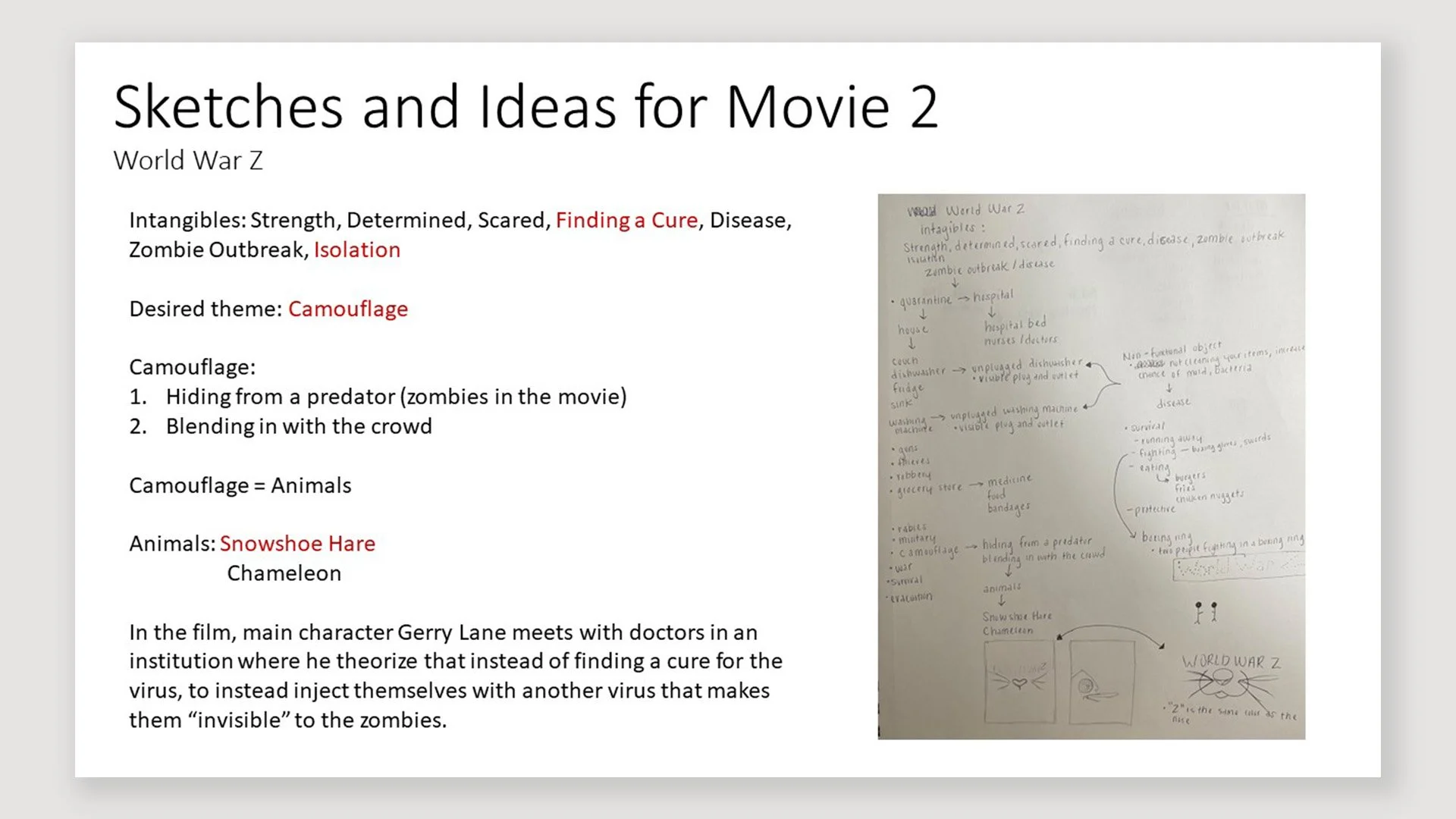
The biggest challenge was narrowing down the film’s many themes into one strong visual metaphor. My first concepts included representing infection with dirty dishes in an unplugged dishwasher or showing the difficulty of finding a cure through a locked door. While compelling in theory, these ideas didn’t translate well into a poster design. I needed a more effective way to capture the film’s central idea of “camouflage.” In the film, the characters are able to move undetected by the zombies after being injected with the cure. They aren’t literally invisible, they’re just immune to being recognized. I wanted to mirror that subtle concept of hidden-in-plain-sight for my poster.
Applications
Adobe Illustrator


First Iterations

Solution
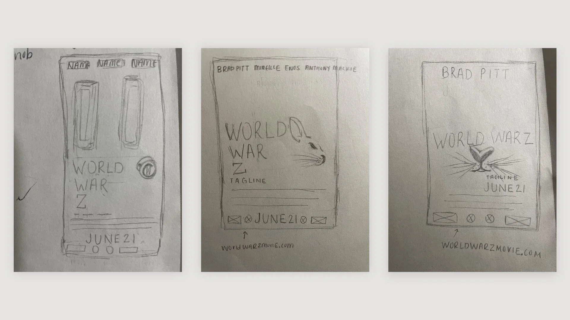
To represent camouflage, I researched animals and found the snowshoe hare, known for blending seamlessly into its snowy environment. I illustrated only the hare’s most recognizable features: eyes, nose, mouth, and whiskers. I used the white background to “camouflage” the rest of its body. This echoed the film’s idea: the characters weren’t invisible, but the threat simply couldn’t detect them. By hinting at the rabbit without fully revealing it, the design conveyed that same tension. I refined the poster with clean typography (Agency FB, Century Gothic, Baskerville Old Face), used award icons to balance negative space, and emphasized the “Z” in red to capture the seriousness of a zombie apocalypse. The final piece embraced simplicity and negative space as essential design elements, resulting in one of my most challenging yet rewarding projects.


